05/02/2025- 19/12/2025 (Week 1-Week 3)
Lizzie Tanaka (0362065)
Information Design | BDCM | Taylor's University
Exercises
LECTURE
Week 1
Fig 1.1 Week 1 Lecture PPT
- Infographics are to increase engagement and capture audience's attention and to communicate ideas
- The 8 types of infographics
- List infographic: Uses written list, contextualizing information with visuals
- Statistical infographic: Includes pie/bar chart
- How to infographic: Explains how to do something
- Timeline infographic: Uses icons and illustrations, highly visual
- Comparison infographic: Compare and contrast different options
- Map/location infographic: For demographic datas
- Flowchart infographic: Explains steps/sequence or actions
- Process description infographic: Describes main elements, actions, and steps of a process
Week 2
Fig 1.2 Week 2 Lecture PPT
L.A.T.C.H Infographic
- L - Location: Organizing information based on their location
- A - Alphabet: Organizing content alphabetically
- T - Time: Uses the nature of time of the content to structure them
- C - Category: Refers to any meaningful groups that have been defined
- H - Hierarchy: Arranging information by order
Week 3
Fig 1.3 Week 3 Lecture PPT
Miller's Law of Memory
- Suggests how short-term memory is limited when remembering more than 7 information objects and that retaining them doesn't last more than 30 seconds.
- "The Magical Number Seven, Plus or Minus Two": More than this, humans tend to forget the information
- Our brain processes a certain amount of information but doesn't always grasp the entire context of it
- Art of refining options: People have difficulty remembering more than 7 things and if they do, it only lasts for 30 seconds.
- Clustering information is important, chunk the information.
INSTRUCTIONS
Exercise 1 - Quantifiable Information
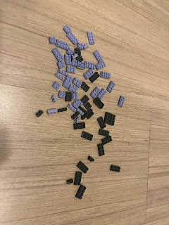
In this exercise, we are to choose quantifiable items such as lego pieces,
MnMs, etc and sort them based on 2-5 categories and present them into a
layout. I chose to use lego pieces. I decided on a total of 69 lego pieces
with two colors (black and purple) and with several sizes.
I first separated my lego pieces and categorize them according to color and
its size. Afterward, I attempted a few ideas. The first idea is quite
random, I just wanted to make it look like it's transitioning seamlessly.
However, after the end result, I didn't like it as it was confusing and hard
to digest. Mr. Shamsul also told me that it was too complicated and people
would have a difficult time understanding the data. He suggested me to
simplify it.
Fig 2.1 Attempt #1
On my second attempt, I focused on my goal to create a simple chart and an
easily understandable layout. I organized this on the category of colors,
amount, and the size of the lego. However, I wanted to try a similar layout
but with a bit of modification at home.
Fig 2.2 Attempt #2
I had arranged my dilatational patterned lego but I felt like it was quite confusing and harder to understand. It didn't seem like a chart or a data, it just looked like I arranged lego pieces into a shape. It was hard to digest the data.
Final Result for Exercise 1
I decided to separate the two into each colors and categorize them into
the sizes.
Exercise 2 L.A.T.C.H Infographic Blog: Here
FEEDBACKS
Week 1
- Exercise 1: Simplify the layout, make it easier to understand for the audience
REFLECTIONS:
Experience:
Throughout the 3 weeks we did this, I learned starting from the basics all over again on how to arrange a good, informative layout that doesn't confuse the audience. Though it was challenging, but I truly think it's a necessary foundation to have before doing exercise 2. Exercise 2 was somehow challenging and I underestimated the time it took for me to complete it. There were many layout changes as I heavily thought about the readability and clarity. However, the end result did satisfy me.
Observations:
I observed that everything in design really needs to be purposeful a.k.a I can't just do things because I want it like that. There needs a lot of consideration of the audience's readability, legibility and how it is accessible.
Findings:
Quantifiable information is a good exercise where I find myself trying to think of a creative layout and keep it still simple enough and straightforward enough.


Comments
Post a Comment