05/02/2025- 19/12/2025 (Week 1-Week 3)
Lizzie Tanaka (0362065)
Information Design | BDCM | Taylor's University
Exercises
LECTURE
In exercise 1 blog.
INSTRUCTIONS
Exercise 2 - L.A.T.C.H Infographic
For our second exercise, we were explained about the L.A.T.C.H principles to create an effective infographic. We're tasked to design an infographic about our chosen topic and use at least 4 of the LATCH principles.
L: Location
A: Alphabet
T: Time
C: Category
H: Hierarchy
I decided on making an infographic on the villains of the Spider-man. However, there are a lot of adaptations of Spider-man, so I chose the three movie trilogies played by three different actors. Using the LATCH principles, I sorted out my information.
L: Location of the villain in the movies
T: The year of release of the movie
C: Divided into three categories: Spiderman movies played by Toby Maguire, Andrew Garfield, and Tom Holland
H: Information is organized from the first villain that appeared in the Spiderman movies to the most recent villain that appeared.
For each villain, I decided to include these pieces of information:
- Name of villain
- Location of the villain
- Year of release and in which trilogy did this villain appear
- 1-2 superpowers
After sorting out all the information I needed for this infographic, I began to try sketching some layouts that I had in mind. I wanted to either go for a more comic, retro, pop art theme, attributing to the Spiderman from the comics or a more sophisticated, movie inspired theme. I was more particular to the comic themed design, so I sketched out a few layouts.

Fig 1.1 Sketch (1)
DIGITIZATION
I first went for the comic theme and organized the color palette and arranged the comic layout. I saw in some comic book layouts, they use squares and rectangles, so I started by having basic 11 squares laid out. Later on, I realized that I only needed 8 villains since 3 of them are repeating villains.
I made the symbols/icons for each movie trilogy, the superpower, and the location pin symbol. I chose to use a comic drawing at first so that it would fit the theme better and started to arrange the information.
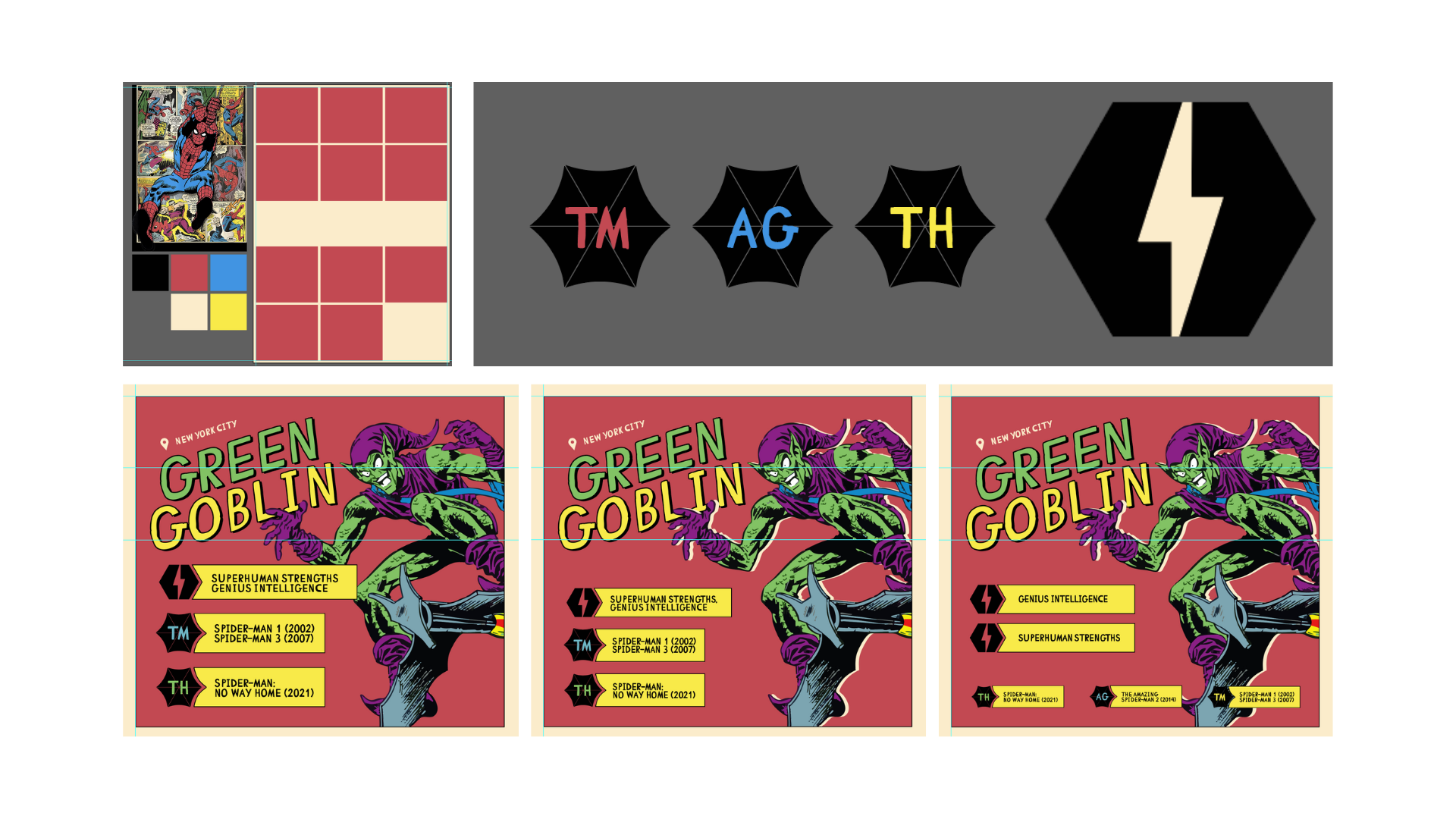
Fig 1.2 First comic theme attempt

Fig 1.3 Other attempts on comic theme
I decided to go for a change in theme. I went for a more general theme and tried to use these spider-web inspired (?) shapes. Mr. Shamsul also suggested me to try something more sophisticated looking since it's for the movie franchise and not the comic. I wanted to have the spiderman appearing from the side of the poster. However, even though it went well on the first few villains, the layout got harder and more difficult. Moreover, I felt like it looked too full and crowded, with barely any space for the title. I attempted this poster in Photoshop, using gradient map, masking, and pen tool. Because I wasn't too satisfied, I decided to explore.

Fig 1.4 Attempt #3 of a more sophisticated poster

Fig 1.5 Rough sketches
To start it out, I decided to put the title in the middle and have it look like a film roll while it has the shapes coming out from behind the roll. With this layout, I felt like it was more promising. After I finished putting all the villains info in, I worked on the title section. I decided to add the legend for the year of release so that it would be clearer for the audience. I added another flying Spider-man in the middle. Moreover, I tried to incorporate the cityscape into the film roll. The cityscape is flipped upside down the bottom area as well to reflect the multiverse aspect of Spider-man movies.

Fig 1.6 Fourth and final attempt on the infographic
As a finishing touch, I added some textures so that it wouldn't be too flat. I also added spider cobwebs behind each villain to add more depth.
I was originally confused with how I should be arranging the villains so that the reading flow would be accurate. I decided to go with the 'Z' reading flow where it starts from the left to right and continue from left to right again on the next row. I find that this also makes sense with the villains as the first 4 villains are from the Tobey Maguire movie franchise, continued with 2 villains from Andrew Garfield's movie franchise, and ends with the 2 villains from the Tom Holland's franchise.

Fig 1.7 LATCH Infographic Final Result
FEEDBACKS
Week 2
- Exercise 2: Spider-man might not have enough content to talk about, focusing on the villains is better.
REFLECTIONS:
Experience:
Exercise 2 is both stressful and fun. I feel like it was fun getting to create an infographic about a topic I enjoyed. However, for this particular poster, it took me numerous trials and errors to get to a point where I was satisfied. In this one, I reconsidered a lot of design choices to prioritize readability as I think it was the focus of this exercise. It felt a bit complicated having to balance the fun design, innovativeness of design and keep it simple and readable.
Observations:
I observed that when doing information design, I tend to focus more on the visual aesthetics, sometimes prioritizing it over the information and how clear it is to the audience in terms of understanding and reading direction.
Findings:
I find that in designing an information-heavy layout, there needs to be a clear balance of readability, legibility with how attractive it appears.
Comments
Post a Comment